Guest Contribution | Zdravka Sahatchieva on COLOUR AND VISION IN THE BULGARIAN CITYSCAPE (1)
deconarch.com is happy to present another series by an international guest contributor. Zdravka Sahatchieva is a Bulgarian architect who researched on the meaning of colour in Bulgarian architecture during the past centuries.
Colour and light are undoubtedly eminent factors influence an urban environment. In this, they not only contribute to the „exterior“ appearance of a city, but also to the psycho-physiological and spiritual perception of its inhabitants. Zdravka analyses the usage of colour and its influecne in Bulgarian towns, considering historical, economical and social processes during the ages. As a result she develops a suggestion how colour design could be used in urban planning.
In order to analyse colour’s role in the appearance of the contemporary city, she starts with a retrospective analysis of the colour’s function in the Bulgarian city during the last 200 years, considering the influence, which diverse factors have had on its usage in the city environment elements and thus – on the human psyche at all.
Zdravka’s essay has been pulished in 5. Ulusal Aydinlatma Kongresi 2004, Istanbul. deconarch.com presents an adapted and slighly shortened version in three parts. We’re starting with a view on the Bulgarian revival 200 years ago.
Text and illus. © Zdravka Sahatchieva
arch. Zdravka Sahatchieva
COLOUR AND VISION IN THE BULGARIAN CITYSCAPE – Part 1
Colour and its influence
Colour plays a significant role in our habitat as a part of our everyday life. It affects our senses – sight, touch, taste and even hearing. It can be emotional – exciting, stimulating, calming. Colour can sway thinking; change the actions, cause reactions. It can irritate or sooth the eyes, rise the blood pressure, or suppress the appetite.[1] We do not only notice the colours, we also feel them. Mentally, physically, emotionally and spiritually, they empower us. Colour arouses many feelings and memories, good and bad; it can make us happy or sad. It is so much part of our daily life that we are often not aware of the powerful effect it has on our moods and interaction with the surroundings.

Colour is power and energy. Without colour, life as we know it would be drab and dreary. As a powerful form of communication, colour is irreplaceable. It is the first sign by which we define the objects and comprehend their semantics. Colour can change the apparent shape and size of spaces and objects and affect the way we feel. When used in a right way, colour can save on energy consumption. When used in a wrong way, it can contribute to the global pollution.
In the architecture colour is a characteristic of the architectural environment, it is the city’s historical spirit, an important element of the national culture and one of the main elements in the contemporary city environment development.[2]
The Bulgarian Revival
 During the Bulgarian Revival changes took place and this happened without any external influence. Builders developed and completed a movement, which started on a purely local basis. The cities changed their outlines considerably. Their size and impact were human-like and not so imposing; the power of their effect is in their harmony and beauty and not in the magnitude.
Some new types of public buildings appeared: clock towers, schools, post offices, and barracks for the Turkish troops. There were well-developed religious buildings, like monasteries and churches, which represent a synthesis of architecture, painting, sculpture and carving. The Revival home was a unique expression of the Bulgarians’ inner sense for harmony and equilibrium, which determined the whole architectural composition and embodied its practicality as well.
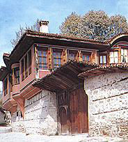
 The city environment posed greater demands before the building colour design. A richer palette was used. Houses had diverse facade colourings, depending on geographical location, climate, owner’s preferences, nationality, religion and wealth. Furthermore, the southern orientated facades that are exposed to the sunlight are painted in cold blue and the northern ones in warm ochre. Elements and details with different colours were amalgamated over facades and even a painted ornament found its place, in Koprivshtiza and Plovdiv for example.
 The colour in the house architecture was connected mostly with a skilful usage of the building materials, specific for each particular geographical region – the natural brown colour of the timber or the stone colour, ranging from white to grey, yellow and cream. In this way a complete harmony of buildings and environment was achieved.
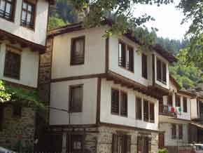
Geographically could be specified the so-called “colour zones”. At the Black Sea region, in Sozopol and Nesebar, the upper floors usually had a wooden casing, and the ground floors were made of stone. In the Rhodope Mountain and Melnik the upper floors are white; in Plovdiv, Koprivshtiza and Vereia there are different colour preferences – yellow, orange-red and blue facades were the most popular.
 In the course of time the masters found out and applied continuously the following principle – a stronger impact of the whole architecture complex could be achieved by mixing colours in one common tone, or by mixing different colours in a common tonality. Important for the house colour harmony was also the pigment extraction from natural sources. A broad range of white, yellow, ochre, brick red and brown was obtained from clay; the cobalt blue – from Cobaltite; the ultramarine – from Lazurite etc. This way of obtaining colour was used from the all the Balkan masters. The experience was passed, acquired and preserved along the generations.
![K15[1]](http://www.deconarch.com/wp-content/uploads/2014/07/K151.jpg) As a conclusion we may say that until the end of the 19th century the colour design of the Bulgarian house architecture has had a tendency toward a polychrome facade, as a symbol of its owner’s enrichment and demonstration of his higher social status of a nascent city bourgeoisie. The pictorial architecture, applied as a décor on the city houses’ facades, shows a growing trend towards europeization, which didn’t exist before.[3]
As a conclusion we may say that until the end of the 19th century the colour design of the Bulgarian house architecture has had a tendency toward a polychrome facade, as a symbol of its owner’s enrichment and demonstration of his higher social status of a nascent city bourgeoisie. The pictorial architecture, applied as a décor on the city houses’ facades, shows a growing trend towards europeization, which didn’t exist before.[3]
——————
[1] Cf. Jill Morton’s Color Matters, www.colormatters.com (1995–2003).
[2] Cf. Larissa Shakinko, Elena Ponomareva, Colour culture and environmental colour design.
[3] Cf. Desislava Nikolaidu, Colour in the appearance of the Balkan house (17th–19th century).


